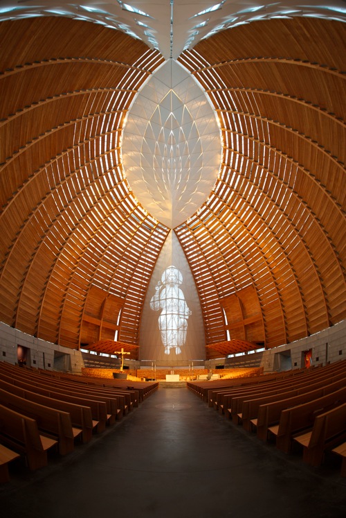
 Which of the above churches looks more aesthetically appealing to you? The top or the bottom one? If you answered ‘top,’ kindly move along as you will at best find offence in what follows. If, however, your answer was ‘bottom,’ please, come with me on a brief journey of ‘I can't believe they said that!’
The church at the top happens to be the Co-Cathedral of the Sacred Heart in Houston while the bottom photo shows the Cathedral of Christ the Light in Oakland. Now, why did I pick these two churches for the following rant? The choice was far from random and was in fact motivated by an article published two days ago by an ‘architectural theorist,’ ‘the author of many books.’ At first I hoped to learn something interesting from reading it, but instead it just made me outraged at the pure nonsense of the views it propounded.
In summary, the article’s author argues in favor of the traditional (yet to the author ‘innovative’) Houston [co-]cathedral, which provides “[h]armonious ornamentation achieved through multiple symmetries [that] nourishes our senses and creates in us a healing state.” The style is even likened to Viennese Secession! [Wagner and Olbrich are spinning in their graves ...]
Instead, the Oakland cathedral is an exercise in technocratic self indulgence, failing to provide a “traditional church volume” and opening itself to criticisms like the following: “Why are the wooden slats horizontal instead of vertical? Are we not trying to connect vertically to the universe, to transcend the materiality of this building so that our souls can rise upwards?” Aside from the obvious counter arguments of why bricks or stone slabs in churches built in the past are not positioned vertically but instead horizontally, I find the idea that the orientation of wooden slats can inhibit transcendence preposterous and trivial (reminding me of the tin foil hats worn by those afraid of having their minds intercepted). Let us take a look at the interior of the Oakland cathedral to get a first hand feel for its potential to enable a rising up of souls:

And for comparison let's also look inside the Houston Co-cathedral:

If you’ve read this far (and are not doing it just to raise your blood pressure), then the above needs no explanation.
Then there are also those “stubborn asymmetries,” “the use of brutalist concrete[, which is] fundamentally unholy [and does not] conveyed a love for the Creator,” and not being “appropriate for housing the timeless truths offered by religion.”
Wow! Not only does the author not like the Oakland cathedral, but considers it unholy and inappropriate! I couldn't disagree more and am baffled by his credentials.
First, let me get one point out of the way: I am grateful for the existence of both buildings since they provide spaces where the Church (i. e., people) can meet to build a community, celebrate mass and house the Eucharist. That is not what this rant is about.
Second, let me challenge the conclusions of the article on theological grounds. Christianity is an incarnate, living, historic religion where it's “timeless truths” are timeless in substance but very much temporally incarnate in form! Since the person of Jesus, the Church has been a body with spatio-temporal location, evolving its understanding and putting into practice of the revelation Jesus brought. How can it therefore be claimed that there are some ancient, preferred church architectures rather than a preference for using the best of contemporary architecture?! Weren't the Hagia Sophia, the Antwerp cathedral and the Sagrada Familia all children of their times? Should church architecture have stopped at the catacombs? I find this kind of thinking as incongruous as that of Catholics who want to cling onto tradition as it was in the early 20th century (but why then?!). Authentic tradition leads up to the now and is the fruit of the Holy Spirit’s continuing life in the Church.
Third, let me argue that the Oakland cathedral is aesthetically vastly superior to the Houston one. Just look at them! The former looks like the result of inspiration meeting taste, while the latter seems to me like a conveyor-belt, Disneyfied knock-off. I guess you either see that or not ...
Apologies if this was too harsh, but I couldn't let a piece like that just go. Not only are there plenty of ‘Catholic’ voices out there that make us seem like fools, but also fools without taste, like the one I tried to respond to here.
No comments:
Post a Comment